Accessible icons help people understand and interact with website features, including navigation menus, search buttons, and status indicators. However, icons can create accessibility barriers when they lack meaningful labels, have insufficient contrast, or cannot be operated with a keyboard. In this guide, we'll explain how to make icons accessible, the WCAG requirements to consider, and how to test icons for common accessibility problems.
What makes an icon accessible?
An accessible icon communicates its intended meaning or function to users, including people who rely on screen readers, keyboard navigation, or other assistive technologies. Under the Web Content Accessibility Guidelines (WCAG), icons must meet relevant accessibility requirements based on their purpose and how users interact with them.
There are three main types of website icons:
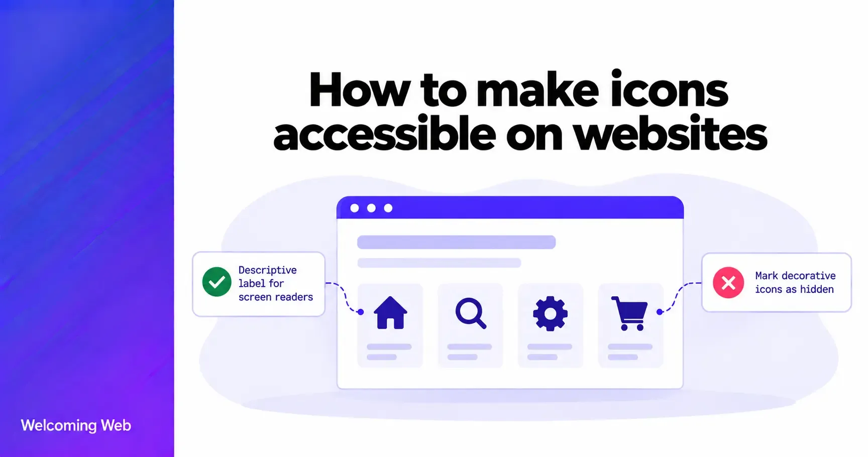
- Decorative icons: Visual elements that add no essential information, such as an arrow alongside a clearly labelled button.
- Informative icons: Icons that communicate information, such as a warning symbol indicating an error.
- Interactive icons: Icons used within buttons or links to perform actions, such as searching, downloading, or closing a menu.
Understanding these differences is important because decorative icons generally need to be hidden from assistive technologies, while informative and interactive icons need accessible alternatives.
To make icons accessible, you need to consider how they communicate information, how clearly they appear on screen, and whether people can interact with them using assistive technologies.
1. Provide meaningful text alternatives
Icons that communicate important information need a text alternative that explains their meaning. For example, a warning icon displayed beside a form error should communicate that an error has occurred. If the surrounding text already provides this information, the icon may not need a separate accessible description.
For image-based icons, use the HTML alt attribute to provide an appropriate alternative. The description should communicate the information or purpose rather than the icon's visual appearance.
The W3C's image accessibility guidance explains how text alternatives should vary according to an image's function.
2. Hide decorative icons from screen readers
Decorative icons do not need to be announced by screen readers because they provide no additional information. A shopping basket icon displayed beside the text "View basket" may be decorative because the visible label already communicates the action.
For icons implemented using an HTML image element, use an empty alternative text attribute:
<img src="basket.svg" alt="">
For decorative inline SVG icons, aria-hidden="true" can prevent screen readers from announcing them. This helps reduce unnecessary announcements and makes website content easier to navigate.
3. Give icon-only buttons accessible names
Icon-only buttons can be difficult for screen reader users to understand when they have no accessible name. For example, a button displaying only a magnifying glass might be visually recognisable as a search control, but its purpose must also be available to assistive technologies.
An accessible name can be provided using aria-label:
<button type="button" aria-label="Search">
<svg aria-hidden="true" viewBox="0 0 24 24">
<!-- Search icon -->
</svg>
</button>
The label describes the action. For example, "Search" is more useful than "Magnifying glass". Whenever practical, combine icons with visible text labels to make controls easier for everyone to understand.
4. Use sufficient colour contrast
Icons must be visually distinguishable from their backgrounds, particularly when they communicate information or identify interactive controls.
Under WCAG 2.2 Success Criterion 1.4.11, meaningful graphical objects and visual information needed to identify user interface components generally require a contrast ratio of at least 3:1 against adjacent colours. A pale grey warning icon on a white background, for example, may be difficult for users with low vision to recognise.
5. Make interactive icons keyboard accessible
Icons used as buttons or links must support keyboard navigation. Users should be able to reach interactive controls using the Tab key and activate them using the expected keyboard commands.
Use native HTML elements such as <button> and <a> wherever possible, rather than adding click handlers to non-interactive elements. Interactive icons should also have a visible keyboard focus indicator so users can identify which control is currently selected.
6. Make icon buttons easy to select
Small icon buttons can be difficult to activate, particularly for people with limited dexterity or those using touchscreens. WCAG 2.2 Success Criterion 2.5.8 requires pointer targets to be at least 24 × 24 CSS pixels, with exceptions including sufficient spacing between smaller targets.
Aim for comfortably sized interactive areas and adequate spacing between controls. The clickable target can be larger than the visible icon.
7. Don't rely on icons or colour to communicate meaning
Icons are not always interpreted consistently. A symbol that seems obvious to one person may be unfamiliar or ambiguous to another. For example, a red cross might indicate an error, an unavailable feature, or an action to close something.
Where possible, pair important icons with descriptive text. Status indicators should also communicate their meaning through text or another accessible mechanism. Consistent icon use throughout a website can help visitors learn what different symbols represent.
How to make SVG icons accessible
Inline SVG icons can use a <title> element and aria-labelledby to provide an accessible name that screen readers can announce. An informative warning icon can be implemented as follows:
<svg role="img" aria-labelledby="status-title"
viewBox="0 0 24 24">
<title id="status-title">Warning</title>
<!-- SVG paths -->
</svg>
The role="img" attribute identifies the SVG as an image, while aria-labelledby connects it to the descriptive title. Use a unique title ID for each SVG instance on the page.
Common icon accessibility mistakes
Even familiar website icons can create accessibility barriers when implemented incorrectly. Common mistakes include:
- Missing accessible names: Icon-only buttons that screen readers announce without a meaningful description.
- Unnecessary screen reader announcements: Decorative icons that repeat information already provided by nearby text.
- Low contrast: Important icons that are difficult to distinguish from their backgrounds.
- Mouse-only interactions: Icon controls that cannot be reached or activated using a keyboard.
- Small clickable areas: Controls that are difficult to select accurately on touchscreens.
- Ambiguous symbols: Icons that lack enough context for users to understand their meaning.
Many of these issues can be prevented by using semantic HTML, meaningful labels, and consistent design patterns.
How to test icon accessibility
Testing icon accessibility helps confirm whether icons are understandable, visible, and usable across different interaction methods. An icon accessibility check should include:
- Automated accessibility testing: Scan pages for supported issues, including certain missing accessible names and contrast failures.
- Keyboard testing: Navigate through interactive icons using the keyboard and confirm that each control can be activated.
- Screen reader testing: Check whether informative icons and icon-only controls are announced correctly, without unnecessary decorative content.
- Visual inspection: Review icon contrast, spacing, sizing, and clarity at different screen sizes and zoom levels.
Automated tools are useful for identifying some icon accessibility problems, however they cannot reliably determine whether every icon's label accurately describes its purpose or whether a symbol is understandable in context.
Welcoming Web's accessibility monitoring helps businesses identify supported website accessibility issues, review AI-assisted remediation suggestions, and track findings as their websites change.
Combining automated checks with manual testing provides a better understanding of icon accessibility.
Make your website icons easier to use
Accessible icons help people navigate websites, understand important information, and interact with controls. Providing meaningful labels, maintaining sufficient contrast, and supporting keyboard navigation can prevent common accessibility barriers.
Whether you're designing new icons or reviewing an existing website, regular accessibility testing can help identify issues before they affect more visitors. Get a free accessibility scan with Welcoming Web and identify potential accessibility issues to start improving your website.

Written by
Alisan Erdemli
CEO at Welcoming Web, and web accessibility technology expert
Connect on LinkedInReady to Make Your Website Accessible?
Join thousands of satisfied users who trust WelcomingWeb to deliver fully accessible, compliant, and inclusive digital experiences.