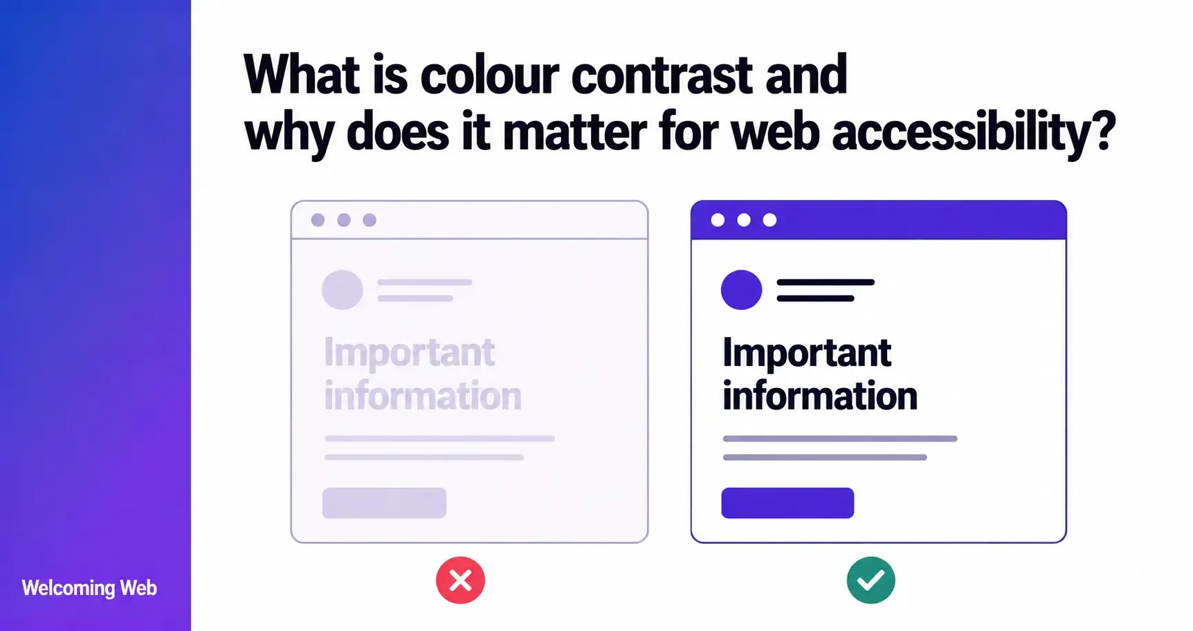
Colour contrast in web accessibility is the measurable difference in luminance between a foreground element, such as text, and its background. When that difference is too small, content becomes unreadable for users with low vision or colour blindness. WCAG sets specific contrast ratio requirements that determine whether a website meets accessibility standards. This guide covers what those requirements are, who they affect, and how to fix failures on your site.
What is colour contrast and how is it measured?
Colour contrast in web accessibility is the difference in perceived brightness between two colours placed next to each other, typically text and its background. It is measured as a ratio, ranging from 1:1, which represents no contrast at all, to 21:1, which represents the maximum possible contrast between black text on a white background.
The ratio is calculated using a formula based on the relative luminance of each colour, which is a measure of how much light a colour appears to emit. A higher ratio means a greater difference in brightness and easier readability. A lower ratio means the colours are closer in brightness and harder to distinguish, particularly for users with visual impairments.
Contrast ratios apply to any situation where foreground content needs to be distinguished from a background:
- Text on a background colour
- Text overlaid on an image or gradient
- Icons and user interface elements against their surrounding colour
- Input field borders against the page background
- Focus indicators against adjacent colours
Why does colour contrast matter for users with visual impairments?
Poor colour contrast is one of the most common accessibility barriers on the web, and one of the most significant for users who rely on being able to distinguish text from its background.
Low vision affects a large portion of the population, including many people who do not consider themselves to have a disability. For someone with reduced visual acuity, text that passes casual inspection may be completely unreadable. Grey text on a white background is a common design choice that frequently fails contrast requirements and creates a genuine barrier for users with low vision.
Colour blindness affects approximately 8% of men and 0.5% of women globally, according to the Colour Blind Awareness organisation. The most common forms affect the ability to distinguish red from green or blue from yellow. Poor contrast between colours that appear similar to a colour blind user makes content inaccessible regardless of how clear it looks to someone with typical colour vision.
Cognitive and neurological conditions also affect how users perceive contrast. Users with dyslexia, ADHD, or conditions that affect visual processing can find low contrast text significantly harder to read, even when their visual acuity is typical.
Beyond users with disabilities, contrast affects everyone using a screen in challenging conditions. Bright sunlight reduces effective contrast on any display. Small screens and low-quality displays produce lower perceived contrast. Older screens lose brightness over time. A site that passes contrast requirements in ideal conditions performs better for all users across all conditions.
What does WCAG require for colour contrast?
WCAG organises website colour contrast requirements under the Perceivable principle and sets specific minimum ratios at each conformance level. The requirements differ based on text size and the type of content being displayed.
What are the WCAG contrast ratio requirements for text?
For text content, WCAG 2.1 and WCAG 2.2 set the following minimum contrast ratios:
Level AA (the standard most organisations target):
- Normal text: minimum contrast ratio of 4.5:1
- Large text: minimum contrast ratio of 3:1
Level AAA (enhanced, optional for most organisations):
- Normal text: minimum contrast ratio of 7:1
- Large text: minimum contrast ratio of 4.5:1
WCAG defines large text as text that is at least 18 points (approximately 24 pixels) in size, or at least 14 points (approximately 18.67 pixels) if it is bold. Text below these sizes is treated as normal text and must meet the higher 4.5:1 ratio at Level AA.
What are the WCAG contrast requirements for non-text elements?
WCAG 1.4.11 Non-text Contrast, introduced in WCAG 2.1, requires that user interface components and graphical objects have a contrast ratio of at least 3:1 against adjacent colours. This applies to:
- Form input borders against the page background
- Button outlines and states
- Focus indicators around interactive elements
- Icons and graphics that convey meaning
- Charts and data visualisations where colour distinguishes data
What content is exempt from WCAG contrast requirements?
WCAG does not require contrast testing for all content. Exemptions include:
- Logotypes and brand names
- Decorative text that conveys no information
- Inactive or disabled user interface components
- Text that is part of an image containing other significant visual content
These exemptions exist because the information they contain is conveyed through other means or is not required for the user to understand the content.
What does a colour contrast ratio of 4.5:1 look like?
The 4.5:1 ratio is the minimum website colour contrast requirement for normal text at WCAG Level AA, and it can be difficult to visualise without examples. A few reference points help ground it:
Black text on a white background produces a contrast ratio of 21:1, the maximum possible. Dark grey text at #595959 on a white background produces a ratio of approximately 7:1, meeting Level AAA. Medium grey at #767676 on white produces approximately 4.54:1, just meeting Level AA. Light grey at #949494 on white produces approximately 3:1, failing Level AA for normal text.
Many commonly used grey text colours, particularly those chosen for aesthetic reasons like "softer" or "more refined" appearances, fall below the 4.5:1 threshold. The same applies to coloured text on coloured backgrounds, where brand colours chosen for visual identity reasons often fail contrast requirements when placed against certain background colours.
How do you check colour contrast on a website?
Checking colour contrast requires knowing the exact colour values of both the foreground and background elements. Colour contrast can be checked in several ways. These include:
- During design. Design tools including Figma and Adobe XD have built-in or plugin-based contrast checking. Running contrast checks during the design phase is significantly more efficient than fixing failures after development.
- During development. Browser developer tools in Chrome and Firefox display contrast ratio information when inspecting text elements. This allows developers to verify contrast as they build, rather than discovering failures later.
- Accessibility scanning. Website accessibility monitoring tools check pages for contrast failures at scale, identifying which elements fail and what ratio they currently achieve. Welcoming Web's scanning tools check pages against WCAG 2.2 contrast requirements, recording each failure alongside the element affected, the current contrast ratio, and the success criterion it relates to. This gives teams a specific, actionable issue list to work from.
A limitation of automated scanning is that it reads programmatic colour values from the page's CSS. It cannot accurately check contrast for text overlaid on images or gradients, where the background colour varies, or for text rendered inside images. These cases require manual review.
What are the most common colour contrast failures on websites?
Website colour contrast failures appear in predictable places across most websites. Understanding where they commonly occur helps teams prioritise where to look first. Some common failures you may find are:
- Grey body text. Designers frequently choose light or medium grey for body text to create a softer visual hierarchy. Many grey shades that appear readable on high-quality monitors fall below 4.5:1 when measured against a white background.
- Placeholder text in form fields. Placeholder text is typically styled in a lighter colour than input text. Many implementations fail contrast requirements, making it difficult for users with low vision to read instructions inside form fields.
- Coloured text on coloured backgrounds. Brand colour combinations that look visually balanced can fail contrast requirements. Blue text on a light blue background, or orange text on a yellow background, are common examples.
- Text overlaid on images. Hero sections and banners frequently place text over photographs. The contrast between text and background varies across the image, making it difficult to guarantee consistent compliance.
- Disabled state styling. Buttons and form elements in their disabled state are exempt from contrast requirements, but active states (including hover and focus states) must still meet the required ratios.
- Focus indicators. WCAG 2.2 introduces specific contrast requirements for focus indicators under success criterion 2.4.11 Focus Not Obscured and the Level AAA criterion 2.4.13 Focus Appearance. Many default browser focus styles and custom focus indicators fail these requirements.
How do you fix colour contrast failures?
Fixing colour contrast failures is generally straightforward once the specific failures and their current ratios have been identified. The fix in most cases is adjusting the colour value of either the text or the background until the required ratio is met.
A few practical approaches include:
Darken the text colour. For grey or coloured text on a light background, darkening the text colour is the most direct fix. A tool that calculates the contrast ratio in real time makes it straightforward to find the minimum value that meets the required threshold.
Lighten or darken the background. Where the text colour is fixed for brand reasons, adjusting the background colour can achieve the required ratio without changing the text.
Increase text size. Where a text element falls just below the 4.5:1 threshold, increasing it to large text size (18 points or 14 points bold) reduces the requirement to 3:1, which may be achievable without changing any colour values.
Add a text background or overlay. For text overlaid on images, adding a semi-transparent dark or light overlay behind the text increases the effective contrast without changing the image itself.
Welcoming Web's AI-assisted remediation generates suggested fixes for colour contrast failures identified during scanning. For each contrast failure, the suggestion includes an adjusted colour value that meets the required ratio. Teams can review these suggestions before applying them, or choose to address the fix manually. No change is applied without approval.
Key takeaways for colour contrast and web accessibility
Colour contrast is one of the most common accessibility failures on the web and one of the most consistently overlooked during design and development. It affects users with low vision, colour blindness, and cognitive conditions, and it affects all users across challenging viewing conditions. WCAG's website colour contrast requirements are specific, testable, and legally referenced across the UK, EU, and US, making contrast failures a genuine compliance risk as well as a usability one.
Conducting an accessibility scan with Welcoming Web takes 60 seconds and can help you identify colour contrast failures on your site, grouped by severity and linked to the specific WCAG criterion each one relates to. That is the starting point for fixing them systematically.

Written by
Alisan Erdemli
CEO at Welcoming Web, and web accessibility technology expert
Connect on LinkedInReady to Make Your Website Accessible?
Join thousands of satisfied users who trust WelcomingWeb to deliver fully accessible, compliant, and inclusive digital experiences.