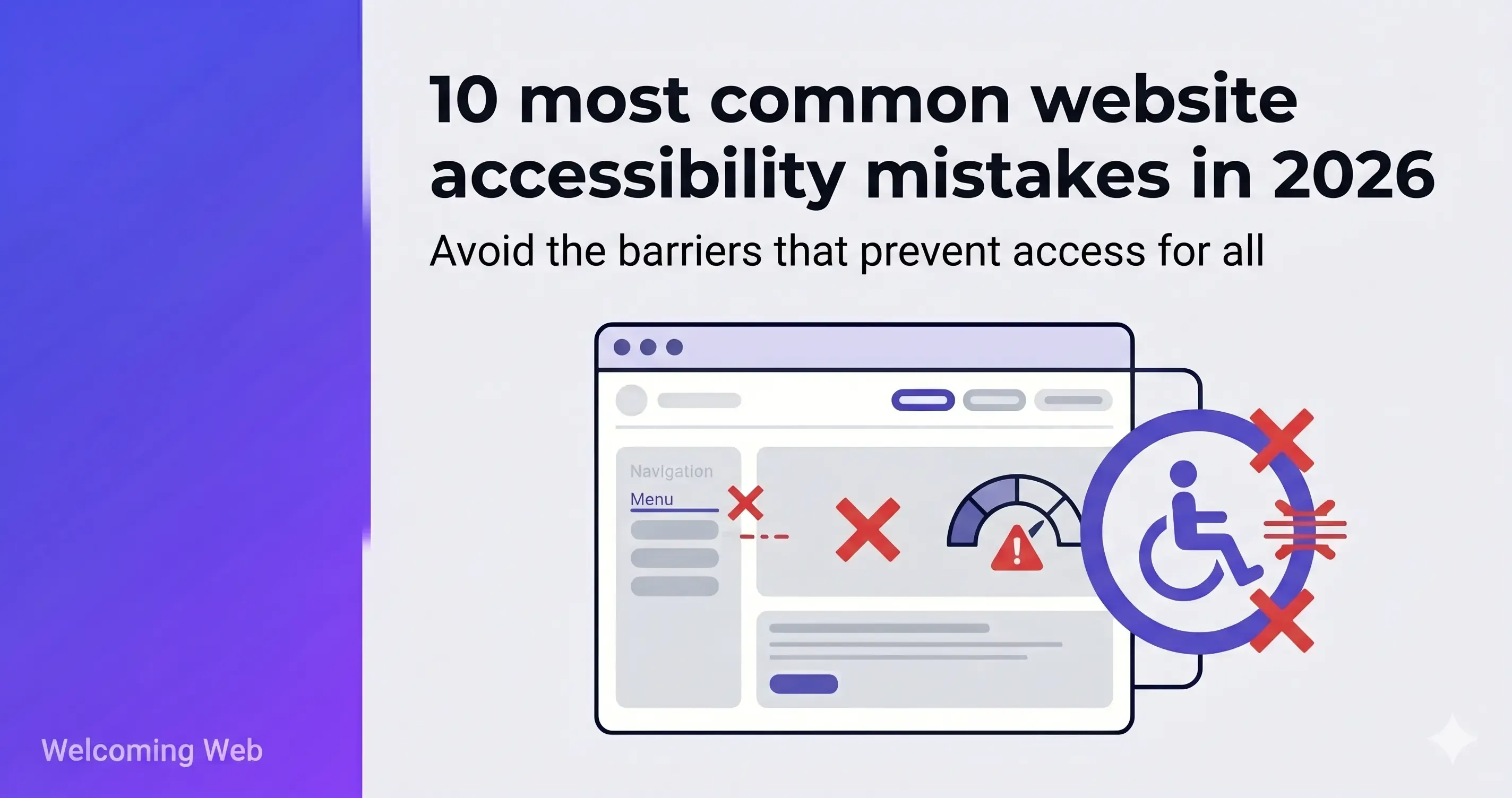
Most websites fail basic accessibility standards. The same failure types appear consistently across the web: missing image descriptions, low colour contrast, and unlabelled form fields account for a significant share of detectable WCAG errors found during accessibility audits. This article covers the ten most common accessibility problems. For each one, we explain which standard it violates and what fixing it actually involves.
Why are accessibility errors so common on websites?
Accessibility is rarely built into how websites are made from the start. Teams add new pages, swap templates, and integrate third-party components without accessibility review or compliance monitoring. Each change is small. Over time the failures accumulate. Most sites end up with a backlog of issues that sits undetected until a scan or audit surfaces them.
According to WebAIM's Million report, 95.9% of the one million most visited websites had detectable WCAG failures in 2026. The same failure types appear at the top of that list every year.
If you want to know which of these apply to your site, a free accessibility scan takes as little as 60 seconds.
What are the ten most common website accessibility mistakes?
The website accessibility mistakes below are the failure types that appear most frequently across the web. The first six come directly from WebAIM's Million report, which analyses the home pages of the one million most visited websites for detectable WCAG failures each year. The remaining four appear consistently in accessibility audits and are worth addressing alongside them. Each entry covers who the issue affects, which WCAG criterion it violates, and what remediation involves.
1. Low colour contrast between text and background
Low contrast text is the most frequently detected accessibility failure on the web. WebAIM's Million report consistently finds it on over 80% of tested home pages.
The people most affected are users with low vision, colour blindness, and older adults whose contrast sensitivity declines with age. But low contrast also hits anyone reading outdoors, on a budget screen, or in a bright room. The issue is far more widespread than most teams expect.
Which standard it violates: WCAG 1.4.3 requires a contrast ratio of at least 4.5:1 for normal text and 3:1 for large text (18pt or 14pt bold and above).
What fixing it involves: Identify the specific text and background colour pairings that fail. Adjust hex values until the ratio meets the minimum requirement. The fix itself is a CSS change. Most contrast failures on a site can be resolved in a single development session. On CMS-based sites with a theme editor, some can be fixed without touching code at all.
2. Missing or inadequate alt text on images
Alt text is the text description attached to an image in HTML. Screen readers read it aloud for users who cannot see the image. When alt text is absent, empty, or unhelpful ("img001.jpg" or "photo of team"), those users get no valuable information about what's being displayed.
Over half of tested home pages have images with missing or empty alt text. This is a content problem more than a development problem. Developers usually add the alt attribute to the HTML template but writers and content editors may fill it with text that is not useful.
Which standard it violates: WCAG 1.1.1 requires a text alternative for every non-decorative image.
What fixing it involves: Decorative images (background shapes, dividers, decorative borders) should carry empty alt text: alt="". This tells screen readers to skip the image entirely. Informative images need a description of what the image shows and why it matters on that specific page. A graph needs a description of what the data shows, not "bar chart." Complex visualisations may need a data table or long description in the page content itself.
This is a content task that does not always require developer time. It can be done page by page, directly in a CMS, as part of a normal content review.
3. Form fields without visible labels
A form field without a visible label creates a specific problem for screen reader users: they cannot tell what information the field is asking for. It also creates a problem for users with cognitive disabilities, who may lose track of what they were filling in once the placeholder text disappears on typing.
Placeholder text is not an effective label. It disappears the moment a user starts typing, leaving nothing behind to indicate what the field requires.
Nearly half of tested home pages have at least one form with missing or inadequate labels.
Which standard it violates: WCAG 1.3.1 and WCAG 3.3.2 both require that labels for user interface components are present, descriptive, and persistent.
What fixing it involves: Add a <label> element to every form input, associated via a for attribute that matches the input's id. If visible labels genuinely cannot be added for design reasons, an ARIA label can substitute, but visible labels are always preferable. This is a development fix.
4. Empty links
An empty link is a link with no text content. Screen readers encounter it and have nothing to read out. The user knows a link exists but has no idea where it goes or what it does.
Empty links appeared on 46.3% of tested home pages in 2026. A common cause is an image used as a link where the image has no alt text. The link wraps the image, the image has no description, and the result is a completely unlabelled interactive element.
Which standard it violates: WCAG 2.4.4 requires that the purpose of each link can be determined from the link text alone, or from the link text and its programmatic context.
What fixing it involves: Every linked image needs descriptive alt text that explains where the link goes, not only what the image shows. Standalone anchor elements with no content need either visible text or an aria-label added. A related issue worth checking at the same time is ambiguous link text such as "click here" or "read more," which appears on 15.2% of pages and creates similar problems for screen reader users navigating by links.
5. Empty buttons
An empty button is a button with no accessible name. It is typically an icon button where a developer has used a visual icon to indicate the action but has not provided any text or label for assistive technology to read. A screen reader encounters it and announces only "button," with no indication of what the button does. Empty buttons are found on 30.6% of home pages.
Which standard it violates: WCAG 4.1.2 requires that all user interface components have a name that can be determined programmatically.
What fixing it involves: Add an aria-label attribute to every icon button that describes the action it performs. "Close", "Search", "Open menu" are all sufficient. Alternatively, add visually hidden text inside the button element. This is a small development fix that can be applied element by element.
6. Missing document language
The HTML lang attribute tells browsers and assistive technology what language a page is written in. Screen readers use it to select the correct voice profile and pronunciation rules. When it is absent, a screen reader may default to the wrong language setting entirely, making the content difficult or impossible to follow for users relying on audio output.
Which standard it violates: WCAG 3.1.1 requires that the default human language of each web page can be determined programmatically.
What fixing it involves: Add a lang attribute to the <html> element with the correct language code. For an English-language page that is lang="en". This is a single line change. On most CMS platforms it can be set globally in the theme or site settings without touching individual pages.
7. Keyboard navigation that breaks or traps focus
A significant proportion of web users cannot use a mouse. They navigate using only a keyboard. For example: Tab to move forward, Shift+Tab to move back, Enter and Space to activate elements, arrow keys for menus. When a website cannot be navigated by keyboard, these users are locked out.
Two failure modes appear most often. The first is an interactive element that is not reachable by keyboard because it was built with non-semantic HTML (a <div> styled as a button instead of an actual <button> element). The second is a focus trap: a modal or dropdown opens and the user cannot get out of it with the keyboard.
Which standard it violates: WCAG 2.1.1 requires that all functionality is available from a keyboard.
What fixing it involves: The fastest test is manual. Unplug a mouse and try to use the site using only Tab, Shift+Tab, Enter, Space, and arrow keys. Every interactive element should be reachable. Every modal should close on Escape. Every custom component, including dropdown menus, date pickers, and carousels, needs specific keyboard interaction patterns that match established conventions. Fixing keyboard navigation on sites built with non-semantic HTML requires development work. On sites where components were built correctly, issues are usually isolated and addressable individually.
8. No visible focus indicator
When a keyboard user presses Tab to move through a page, they need to see which element currently has focus. Without a visible focus indicator, there is no way to tell where they are on the page.
Many designers remove browser default focus styles with outline: none in their CSS because they consider the default styles visually unattractive. This is common enough that it appears across a large proportion of professionally designed sites.
Which standard it violates: WCAG 2.4.7 requires that any keyboard-operable interface has a mode of operation where the keyboard focus indicator is visible. WCAG 2.2 also introduced 2.4.11 (Focus Appearance) at AA level, with more specific requirements on the size and contrast of focus indicators.
What fixing it involves: Search the site's CSS for outline: none and outline: 0 applied to :focus states without a replacement style. Remove them. Design a custom focus style with sufficient contrast against its surroundings and a size that is genuinely visible. This is a CSS task.
9. Heading structure that skips levels or is used for visual styling
Screen reader users rely on heading structure to navigate a page. Assistive technology lets them jump between headings, get a page outline, and skip sections. When headings skip levels (jumping from H1 to H3 with no H2) or when heading levels are chosen for how they look rather than their structural role, the page becomes difficult to interpret.
The most common cause is a content editor picking an H3 because "it looks like the right size" with no regard for what heading level logically belongs at that point in the document.
Which standard it violates: WCAG 1.3.1 requires that information and relationships conveyed through presentation can be determined programmatically. A logical heading hierarchy is part of this requirement.
What fixing it involves: Review the heading sequence of each page. There should be exactly one H1. Subheadings descend logically. No levels are skipped. Size and weight should be controlled by CSS, not by choosing a different heading level to get a visual effect.
10. PDFs and documents without accessibility structure
PDFs published on websites are frequently scanned images of physical documents. Screen readers cannot read images of text. Even PDFs generated from Word documents are often missing the accessibility structure that makes them usable: tagged headings, defined reading order, image descriptions, and a document title.
For organisations that publish large volumes of documents (policy libraries, annual reports, product manuals), this is often a large source of accessibility failures on the site, and one that is often underestimated.
Which standard it violates: WCAG 1.1.1 and 1.3.1 apply to documents as well as web pages.
What fixing it involves: PDFs need to be tagged with a logical reading order, heading structure, image alt text, and a document title. Adobe Acrobat Pro includes an accessibility checker and tagging tools. For scanned images of documents, OCR must be applied first, then tagging. For document libraries with hundreds of files, this is the most time-consuming item on this list by a significant margin.
How do you know which accessibility mistakes your site has?
Identifying which accessibility mistakes your site has starts with running an accessibility scan. It checks your pages against WCAG criteria and returns a precise list of the issues present, down to the specific element affected and the success criterion it violates. Manual checks are useful but miss a significant proportion of failures that automated scanning catches reliably.
The ten mistakes above affect the majority of websites, but the specific mix varies from site to site. Welcoming Web is a web accessibility platform that combines accessibility scanning, AI-assisted remediation, and compliance monitoring in one place. A scan checks your pages against WCAG 2.2, ADA Title III, and EN 301 549. There is no developer pipeline required.
Run a free accessibility scan on your site and get results in 60 seconds.

Written by
Alisan Erdemli
CEO at Welcoming Web, and web accessibility technology expert
Connect on LinkedInReady to Make Your Website Accessible?
Join thousands of satisfied users who trust WelcomingWeb to deliver fully accessible, compliant, and inclusive digital experiences.