Accessible website design makes it possible for people with different abilities to navigate pages, understand information, and complete tasks without unnecessary barriers. This includes keyboard-accessible navigation, clearly labelled controls, understandable error messages, and support for assistive technologies. In this article, we explore eight examples of accessible web design, showing how some common website interactions can accommodate different user needs.
What does accessible website design look like?
Accessible website design considers how people interact with a website from the beginning of a task to its completion. This includes how visitors navigate between options, enter information, receive feedback, and recover from mistakes.
For example, an accessible form or booking system should allow someone to select a date using a keyboard, understand which appointments are available, and confirm their selection. Each part of the interaction needs to work together.
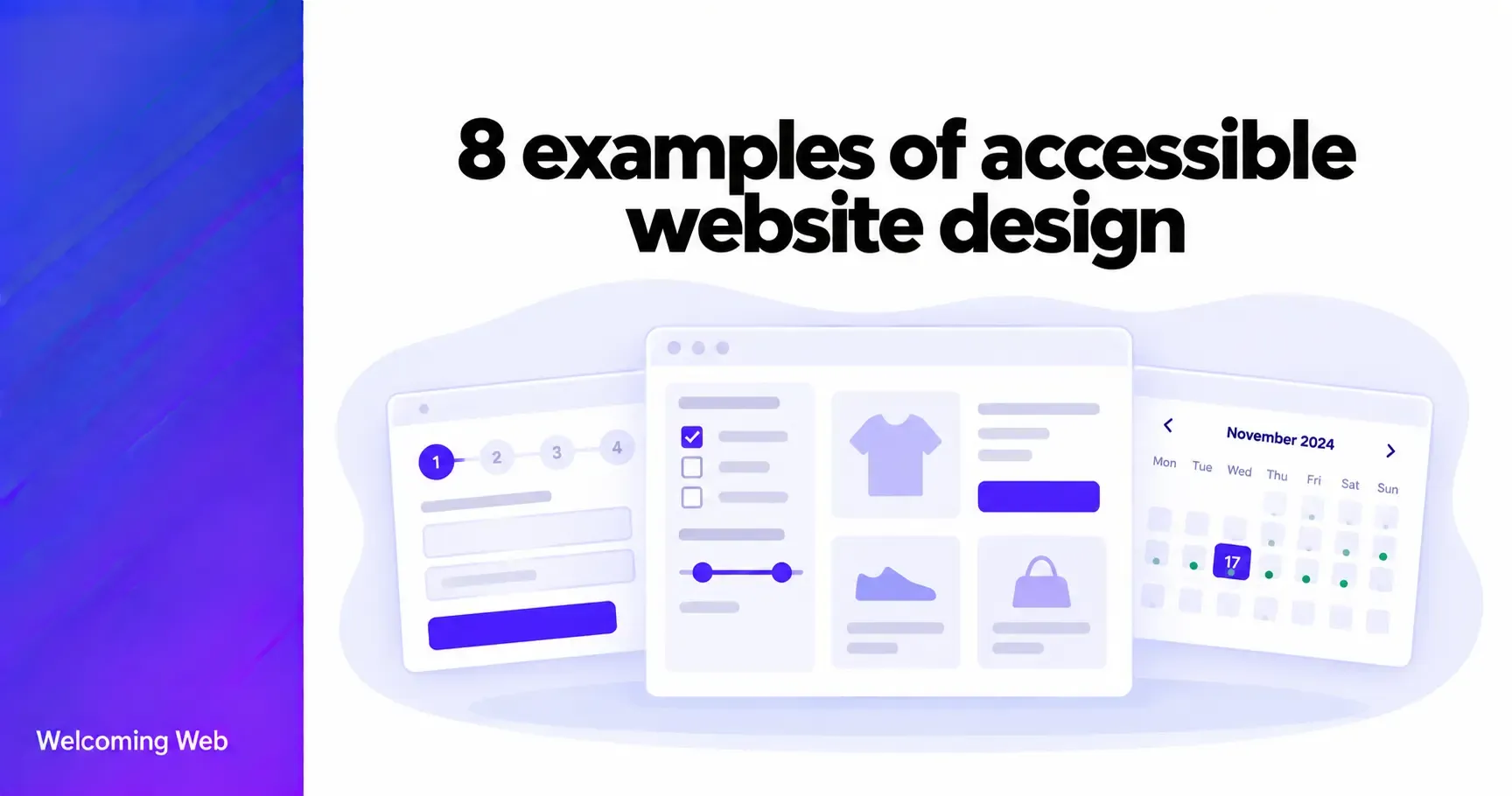
Below are eight examples of how these accessibility considerations apply to common website features.
1. Ecommerce product filters that work with a keyboard
Imagine an online clothing shop where customers can filter products by size, colour, price, and availability. A customer opens the filters and selects a size using the keyboard. They move through the available options in a logical order, select their preferences, and apply the filters without needing a mouse. The website then updates the product results and communicates that the selection has changed.
For someone using a screen reader, each filter has an understandable label. A checkbox for “Medium” is announced with its selected or unselected state, while the price range has a clear name and understandable values.
The customer can also remove individual filters without restarting their search.
This example demonstrates how accessibility applies to an entire shopping interaction. Making the filter controls operable is important, but visitors also need to understand their selections and recognise when the results change.
What makes this design accessible?
- Filter controls have clear names and communicate their selected states.
- Customers can operate the filters without a mouse.
- Changes to product results are communicated appropriately.
- Applied filters can be reviewed and removed.
For ecommerce websites, the important outcome is that customers can independently narrow down products and find what they need.
2. A multi-step checkout that preserves customer progress
Consider a checkout process divided into contact details, delivery information, payment, and order review. At the top of the checkout, a progress indicator shows the customer's current stage and the steps remaining. Text and appropriate markup communicate the current stage, so customers don't have to rely on colour to understand their progress.
A customer completes their delivery information and moves to payment. If their payment details contain an error, the checkout identifies the affected field and explains what needs correcting. Crucially, the customer does not lose the delivery information they have already entered.
The checkout also allows customers to return to an earlier step to change their details. Before placing the order, they can review the delivery address, products, quantities, and total cost. This is particularly valuable for customers who need additional time to complete a purchase or who find lengthy forms difficult to manage.
What makes this design accessible?
- Each checkout stage has a descriptive heading.
- The current step is clearly identified.
- Previously entered information remains available when errors occur.
- Customers can review and correct information before submitting their order.
A checkout should support customers throughout the purchase, including when they make mistakes or need to revisit an earlier decision.
3. An appointment booking calendar with understandable dates
A healthcare website allows patients to book appointments through an online calendar. The calendar displays available appointments across several days. Instead of identifying availability only through green and grey backgrounds, each date also communicates whether appointments are available.
A patient using a screen reader can navigate the calendar and hear information such as “Tuesday, 17 November, three appointments available”. After selecting a date, the patient is presented with available appointment times. Each time is associated with the selected date, so there is no uncertainty about which appointment they are booking. The patient can move backwards to choose another date without losing their place in the booking process.
An accessible calendar also needs to handle unavailable dates appropriately. A date with no appointments should be clearly identified.
What makes this design accessible?
- Dates have understandable labels and availability information.
- The calendar supports appropriate keyboard navigation.
- Selected dates and appointment times are clearly communicated.
- Unavailable dates are distinguishable without relying on colour.
This example shows why accessibility must account for the relationship between controls. A date selector and time selector may each work independently, but customers also need to understand how their choices connect.
4. Search suggestions that are easy to navigate
Imagine a university website with a search field that suggests relevant pages as visitors type. A prospective student begins entering “accommodation”. The website displays suggestions for accommodation fees, student housing, and application deadlines.
A sighted mouse user can select a suggestion directly. A keyboard user can move through the suggestions using the appropriate keys, recognise which option is currently highlighted, and select it without switching input methods.
For someone using a screen reader, the search field communicates that suggestions are available. As the student moves through the results, each suggestion is announced. The suggestions do not unexpectedly move keyboard focus away from the search field or prevent the student from continuing to type. If the student decides not to use the suggestions, they can dismiss them and submit their original search.
What makes this design accessible?
- The search field has a clear accessible name.
- Suggestions are announced to assistive technology.
- Keyboard users can navigate and select suggestions.
- The suggestion list can be dismissed without disrupting the search.
The important detail is that autocomplete remains optional. It helps visitors find information faster without interfering with those who prefer to complete their own search.
5. A modal dialogue that manages keyboard focus
Consider a subscription website where a visitor selects “Change plan” and a confirmation dialogue appears. The dialogue explains the new subscription price and asks the visitor to confirm or cancel the change. When the dialogue opens, keyboard focus moves into it. The visitor can navigate between its controls without accidentally interacting with the page behind it.
The dialogue has an accessible name, such as “Confirm subscription change”, so a screen reader user can understand its purpose immediately. If the visitor selects “Cancel” or presses Escape, the dialogue closes and focus returns to the “Change plan” button that opened it. This means the visitor can continue from the same point without searching through the page to find their previous position.
What makes this design accessible?
- Focus moves into the dialogue when it opens.
- The dialogue communicates its title and purpose.
- Keyboard focus stays within the dialogue until it is closed.
- Closing the dialogue returns focus to a logical location.
Modal dialogues are particularly important because they temporarily change how the page behaves. An accessible implementation makes that change understandable and predictable.
6. A pricing comparison table that works with screen readers
A software company offers three subscription plans: Basic, Professional, and Enterprise. Its pricing page includes a comparison table showing storage limits, user allowances, support options, and available features.
Each plan has a column heading, while each feature has a row heading. These relationships are defined in the table's markup, allowing screen reader users to identify which feature and plan a particular value belongs to. For example, a screen reader user reviewing the Professional plan can understand that its storage allowance is 100 GB without needing to memorise the order of the columns.
The table also avoids relying exclusively on tick and cross icons. Feature availability is communicated through meaningful text or accessible labels.
On smaller screens, the comparison remains usable without removing important information or changing the relationship between features and plans.
What makes this design accessible?
- Row and column headings identify the information being compared.
- Feature availability is communicated without relying on icons alone.
- Screen reader users can understand the relationship between each value and its headings.
- The comparison remains usable when the page is enlarged or viewed on a smaller screen.
An accessible pricing table helps visitors make an informed purchasing decision. The goal is to preserve the meaning of the comparison for people accessing it in different ways.
7. Dashboard notifications that explain what has changed
Imagine a project management dashboard where users can create tasks, update deadlines, and assign work to colleagues. After someone saves a task, a small notification appears saying “Task saved successfully”.
The notification is also communicated to screen reader users through an appropriately configured status message. They receive confirmation without needing to search the page for visual feedback.
Now consider a different situation: the user attempts to delete a project but the action fails. Instead of displaying only a red warning icon, the dashboard presents a specific message such as “The project could not be deleted. Please try again.” If the problem requires the user to take action, the notification explains what they need to do.
Notifications should also be proportionate to their importance. A routine confirmation should not unnecessarily interrupt someone using assistive technology, while an urgent error may require more prominent communication.
What makes this design accessible?
- Status changes are communicated to assistive technology.
- Messages describe what happened in understandable language.
- Errors include useful next steps where appropriate.
- Colour and icons support the message instead of carrying its entire meaning.
This example illustrates an important aspect of accessible design: visitors need feedback after taking an action, even when the resulting change is not immediately visible.
8. A mobile navigation menu that communicates its state
Consider a travel website with a mobile menu containing destinations, accommodation, and booking information. On a smaller screen, the main navigation is hidden behind a button labelled “Open menu”. When a visitor activates the button, the navigation expands. The button's accessible name or state communicates that the menu is now open.
A visitor using a keyboard can move into the navigation, follow its links, and return to the menu button. The menu can also be closed without requiring a touchscreen gesture. Some navigation categories contain additional links. For example, selecting “Destinations” reveals links for Europe, Asia, and Africa.
The expanded or collapsed state of that section is communicated to assistive technology, so users can tell whether more options are available. When the visitor closes the main menu, the page returns to its previous state without leaving focus on an element that is no longer visible.
What makes this design accessible?
- The menu button has a descriptive name.
- Expanded and collapsed states are communicated.
- Navigation links remain operable using a keyboard.
- Focus remains logical when the menu opens or closes.
Mobile navigation demonstrates how accessible design must accommodate different devices and input methods. A compact layout should not make important pages harder to reach.
Build a more accessible website with Welcoming Web
Accessible design should be considered throughout the user experience, from navigating a website to completing forms and interacting with its features. The examples above offer ways to make these everyday interactions more inclusive.
Understanding what accessible design looks like is a useful starting point, but it's equally important to identify where your own website may be creating barriers.
Welcoming Web helps you detect accessibility issues, monitor your website, and find opportunities for improvement with AI-assisted remediation suggestions. Run a free accessibility scan to see where your website could be improved.

Written by
Alisan Erdemli
CEO at Welcoming Web, and web accessibility technology expert
Connect on LinkedInReady to Make Your Website Accessible?
Join thousands of satisfied users who trust WelcomingWeb to deliver fully accessible, compliant, and inclusive digital experiences.