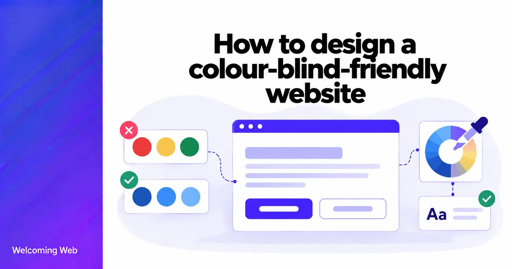
Designing for colour blindness helps make websites easier to navigate and understand for people with colour vision deficiencies. Colour influences how visitors identify buttons, interpret charts, complete forms, and recognise important information. When a design relies on colour differences that some users cannot distinguish, these tasks can become difficult. This guide explains how to design a colour-blind-friendly website using techniques for colour palettes, visual indicators, charts, forms, and navigation.
What is colour-blind-friendly web design?
Colour-blind-friendly web design is the practice of creating websites that remain understandable and usable for people who have difficulty distinguishing certain colours. It involves choosing distinguishable colours and ensuring that important information can be understood through labels, patterns, shapes, and other visual cues.
Colour blindness, also known as colour vision deficiency, affects how people perceive colours. Common forms include red-green colour vision deficiencies, such as protanopia and deuteranopia, and less common blue-yellow deficiencies, such as tritanopia. In rare cases, people may have little or no colour vision.
These differences can affect how visitors interpret buttons, status messages, charts, and other visual elements on a website.
How to approach designing for colour blindness
Designing for colour blindness starts with understanding how people use colour to interpret information on a website. Consider where colours indicate actions, distinguish content, or communicate changes in status, and whether those elements would still make sense if the colours were indistinguishable from one another.
You don't need to remove colour from your design or abandon your existing brand palette. Instead, focus on making important information clear through a combination of colour and other visual cues.
The following seven practices will help you apply these principles when designing your website for accessibility.
1. Avoid relying on colour to communicate information
Colour is useful for drawing attention and organising content, but important information should remain understandable without it. For example, a website might display green circles beside available products and red circles beside unavailable products. Someone who struggles to distinguish these colours may not understand the difference.
A more accessible approach is to combine colour with descriptive labels, such as "In stock", "Out of stock", or "Only 2 remaining". These labels communicate availability directly, while the coloured indicators provide additional visual reinforcement.
The same principle applies to calendars, dashboards, booking systems, forms, and other interfaces where colours represent different meanings.
2. Choose colours that remain distinguishable
Choosing a colour-blind-friendly palette involves considering how colours appear to people with different types of colour vision deficiency. Red and green are a familiar example of colours that can be difficult to distinguish. Other combinations, including blue and purple, green and brown, or yellow and light green, may also cause problems for some users.
When selecting website colours, consider differences in lightness as well as hue. Choose colours with clearly different visual characteristics, particularly when representing opposing states or categories. Test important combinations using colour vision simulations, and use consistent labels or other identifying features where necessary.
There is no single colour palette that works equally well for every form of colour vision deficiency. The aim is to create a design that remains understandable when colour differences are difficult to perceive.
3. Make charts and data visualisations understandable
Charts are a common source of accessibility problems because they often use colour to distinguish data series. For example, a line chart showing three years of sales might use red, green, and orange lines. Some users may struggle to identify which line represents each year.
Instead of relying on a colour-coded legend, consider using:
- Direct labels: Identify data series beside the corresponding lines or bars.
- Different line styles: Use solid, dashed, and dotted lines.
- Distinct markers: Add circles, squares, or triangles to data points.
- Patterns: Use stripes or other textures to distinguish chart sections.
- Supporting data: Provide an accessible table or text summary when appropriate.
Combining different line styles with direct labels can make a chart easier to interpret without requiring users to match colours to a separate legend.
4. Use clear labels for form errors and required fields
Forms frequently use colour to indicate errors, required information, or successful submissions. A red border around an input field might suggest that something is wrong, but it does not explain the problem to someone who cannot distinguish the colour change.
Instead of highlighting an invalid email field in red, display a message such as "Enter a valid email address" and associate it programmatically with the input. This tells users exactly what needs to be corrected.
Required fields should also be identified using text such as "Required" or a clearly explained asterisk. These additions help visitors understand and complete forms regardless of how they perceive colour.
5. Make links and navigation states visually distinct
Links, selected menu items, and active navigation tabs often rely on colour changes to show their function or current state. A navigation menu might highlight the current page in blue while displaying other links in grey. If the colours appear similar, visitors may struggle to identify their location.
Additional visual indicators can make these differences clearer. Underline links within paragraphs, use visible borders or indicators for active navigation items, and distinguish selected options with shapes or markers.
An active navigation tab, for instance, could have a coloured background and a visible underline or border. This gives visitors another way to recognise the selected tab without depending on colour differences.
6. Design status messages with text and symbols
Success, warning, and error messages often use familiar colour conventions. Green typically indicates success, amber suggests a warning, and red signals an error. While these conventions can be useful, colour differences may not be enough to communicate the intended message.
Instead, combine colour with meaningful text and, where useful, recognisable symbols. A successful action might display a tick icon alongside "Your changes have been saved", while a warning could include a warning symbol and the message "Your session will expire soon". For errors, provide a clear explanation of what happened, such as "Payment could not be processed". Any symbols should support the message instead of replacing it, particularly when an icon's meaning could be ambiguous.
7. Test your website using colour vision simulations
Colour vision simulations can help designers identify areas where important colours become difficult to distinguish. Some browser developer tools and specialist accessibility tools can approximate how a website may appear to people with different colour vision deficiencies.
When testing your site, pay particular attention to charts, form validation, product availability indicators, navigation states, and notifications. Check whether visitors can still understand the information and identify the correct actions when colours appear similar.
Viewing a page in greyscale can also help reveal interfaces that depend heavily on colour differences. Where possible, include people with colour vision deficiencies in usability testing and ask them to complete realistic tasks.
Does a colour-blind-friendly website still need colour contrast?
Colour contrast and colour-blind-friendly design address related but different accessibility concerns. Contrast determines how distinguishable an element is from its background, while colour-blind-friendly design also considers whether users can understand information when certain colours appear similar.
A website can meet the relevant contrast requirements and still be difficult to use if, for example, two chart lines are distinguished only by their colours. Businesses should therefore evaluate both the visibility of their content and the way colour communicates meaning.
How to check your website for colour accessibility issues
Reviewing colour accessibility requires a combination of automated checks and manual evaluation. Automated accessibility testing can identify supported issues, such as insufficient contrast between certain elements and their backgrounds. However, determining whether a chart, status indicator, or navigation component relies on colour alone often requires human judgement.
Welcoming Web's accessibility monitoring helps teams identify supported accessibility issues, review remediation suggestions, and monitor their websites as content and designs change. For colour-blind-friendly design, combine these checks with colour vision simulations and manual testing of important user journeys.
Build a website that communicates clearly
A colour-blind-friendly website allows visitors to understand information and complete tasks without depending on their ability to distinguish particular colours. Clear labels, patterns, meaningful symbols, and recognisable interface states help make website experiences more inclusive while preserving a consistent visual identity.
Scan your website today to identify potential issues and improve its accessibility.

Written by
Alisan Erdemli
CEO at Welcoming Web, and web accessibility technology expert
Connect on LinkedInReady to Make Your Website Accessible?
Join thousands of satisfied users who trust WelcomingWeb to deliver fully accessible, compliant, and inclusive digital experiences.